Multimedia is available for this module!
Predicting Graphs in Physical Science
| Multimedia | Practice Homework | Homework |
Context
Modeling physical phenomena using graphs is an important part of science. To understand what is happening well enough to predict what the graph should look like is one of the goals of science.
What do we mean by predicting graphs?
Predicted graphs must be based on our understanding of what we are investigating. The graph must show how one variable will change due to the change of another variable. An example might be "How does the force change as your stretch a rubber band?"
Explanation
In this section we will practice predicting graphs that represent physical changes.
This section will help you:
- See that an understanding of the physical world is needed to predict graphs.
- Predict graphs that relate one observable event to another observable event in a physical system.
Model
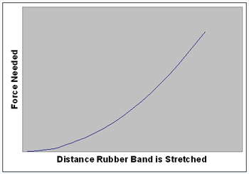
Stretching a Rubber Band. So, how would a graph of Force vs Distance Stretched look for stretching a rubber band? We have all stretched a rubber band and observed that the farther it is stretched, the harder it is to keep stretching it. At some point it becomes impossible to sketch it any farther. The rubber band often breaks but, there does seem to be a place where you can apply more force, but the rubber doesn't stretch any more. That suggests a graph where the force needed to stretch the rubber band is low at the beginning, but increases rapidly to a very large number. Figure 1 is one possible graph that fits this scenario.
Figure 1Notice that we don't know the exact shape of the graph because we don't have numerical data to plot, but we do think the graph of real data should have this general shape. The graph we have drawn represents a theory that we have: "The force needed to stretch a rubber band gets bigger as you stretch the rubber band." We have also added that we think the force will get bigger rapidly after a relatively short amount of stretching. You might recall that this is the general shape of a y = x² graph.
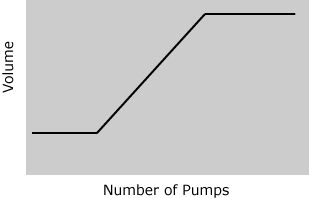
Pumping up a Rubber Ball. Here is another similar question: "How would the volume of a rubber ball change as air is pumped into it?" Let's assume we start out with a ball that is basically flat. It is round, but it will require some air to just get it to the point where the rubber will start stretching. The volume won't change until the rubber starts to stretch, but after it starts stretching the volume will go up. After a while the rubber will be stretched as far as it can go and adding more air will not change the volume. The following graph reflects this reasoning.
Figure 2Remember that we are only predicting the general shape of the graph. The graph for any particular rubber ball would have to be obtained using data from an experiment where the volume was measured as a function of the number of pumps. See the multimedia section for more description of this graph.
Mass Change While Pumping up a Rubber Ball. Which of the following graphs would describe how the mass changes as the ball in the last example is pumped up? We are looking at the mass on the y-axis and the number of pumps on the x-axis (replace volume with mass in Figure 2 above).

a b c d To answer this one we need to know something about air. Does air have mass? I'll let you think about that for a minute. Can you think of a reason why air does or doesn't have mass?
Air is about 80% nitrogen gas and 20% oxygen gas. That may not add up for you because you probably know there are other things in air also, like carbon dioxide and water vapor. It turns out that all of those things add up to about 1% of air. So, maybe it is 79% nitrogen, 20% oxygen, and 1% everything else. I bet we could find out with a google search if you are really interested. The point here, however, is that air is made of matter (nitrogen and oxygen are elements and the elements build all of the matter we observe, so they have mass and take of space like all matter does). Air does indeed have mass.
Every time we pump once into the ball there is a certain amount of air put into the ball. Each pump will increase the mass by the mass of the air that one pump puts in. The mass should increase at a constant rate. Figure (a) above doesn't increase at a constant rate for every pump, so it can't be right. To get Figure (d) we would have to be taking air out of the ball. Figure (c) says that the mass doesn't change at all. Figure (b) is the one that says that the mass will increase at a constant rate with each pump. We predict Figure (b) would be obtained from an experiment that measured mass as a function of the number of pumps.
Speed Along an Incline With Friction. How would the speed vary as a cart rolls down an incline when there is some friction between the cart and the incline? If the friction was too high the cart wouldn't move, so let's consider the case where there is some friction, but not enough to stop the car. A completely different example would be the friction due to air on a skydiver. The air has mass and can exert some friction, but it won't stop the skydiver from falling! The same kind of thing can happen as a cart rolls down an incline. There may be some friction between the cart and the incline, but it generally isn't enough to stop it. So, which of the following graphs would best describe the speed (y-axis) of a cart as it rolled down an incline when there was some friction? The position of the car along the track is on the x-axis.

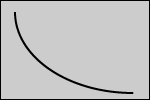
a b c d As the car is let go at the top of the incline gravity will pull it toward the earth and the car will speed up. It would continue to speed up until the frictional slowing force was able to keep the downward accelerating gravitational force from making the cart go faster. At that point the car wouldn't stop, but it would not speed up either. In other words it would go to a constant speed. The graph that we would predict, and that best fits this scenario, is (c). The speed goes up rapidly at first, but goes toward a constant speed after some distance.
A diversion: Skydivers. When skydivers jump from airplanes the friction with the air causes them to stop speeding up and they reach what is called the terminal velocity. The friction between a body and air isn't enough to slow the skydiver down to a speed where they can hit the ground safely, so they open a parachute that has more surface area with the air and that slows them down to a terminal velocity that can keep them from getting hurt. The predicted graph might look something like the following:
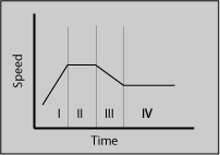
Where section I is the person falling (and speeding up) before getting to the terminal velocity, section II is the terminal velocity without the parachute, section III is after the parachute opens while they are being slowed down, and section IV is the terminal velocity with the parachute open.
Speed Along an Incline Without Friction. Now, what would happen to our car if there was not any friction? Without friction the cart should continue to speed up and not reach any terminal velocity. But would it go up like (c) or (d) above? Or would it just go up in a straight line?
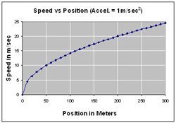
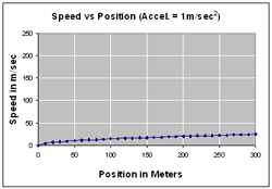
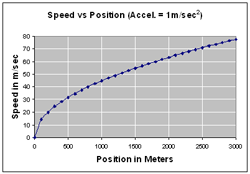
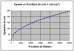
I was wondering how fast the speed would change and did some calculations that generated the following graphs. The graphs in the top row are for a 300 m incline. The graphs in the middle row are for an incline that is 3,000 m long. The first graph in the third row is for a 30,000 m incline and the graph in the bottom right is for an incline that is one million meters long!
These graphs suggest that the shape of the curve is more like (c) than (d), and not a straight line. The speed does go up, but not all that rapidly after the initial rapid increase in speed.
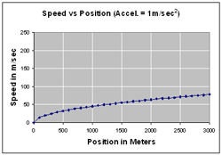
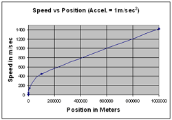
A 300 m ramp is pretty long! Notice how the y-axis scale makes a big difference as to how the graph looks. The two top graphs are for the same data, but the y-axis scale has been changed on the right to match the scale on the third row first graph, where the ramp is 30,000 m long. The middle graphs are for 3000 m ramps. They all assume an acceleration of 1 m/sec².
A typical ramp for classroom use is 100 cm (1 m) long. Assuming an acceleration of 1 m/sec², the speed at the bottom of a 1 m ramp would be 1.41 m/sec. At the end of a 10 m ramp the speed would be 4.47 m/sec and at the end of a 100 m ramp the speed would be 14.14 m/sec. As the first graph shows the speed at the end of a 300 m ramp would be just under 25 m/sec. Here is this data in a table.
Speed at the Bottom of Inclines
With an Acceleration of 1 m/sec²
(Rounded Off to an Integer)Length of Incline Speed at the Bottom 1 m 1 m/sec 10 m 5 m/sec 100 m 14 m/sec 300 m 25 m/sec It might appear that the speed is changing rapidly, but remember that even a 10 m ramp is pretty long! Could you fit it into your classroom?
As was predicted it is theoretically possible to get the speed as high as you want. But these graphs show that to see the difference in speed after the first few hundred meters would take a ramp that is impossibly long. Why is that? Without friction the cart would go faster after every meter. In a pretty short amount of time the cart would cover one meter so fast that it will require a lot of meters to see any change in the speed.
Thinking Questions
- Can we always predict the shape of an experimental curve?
- If the experimental curve isn't the same as our prediction, what do we do?
- How important is it to understand the science before making a prediction?
